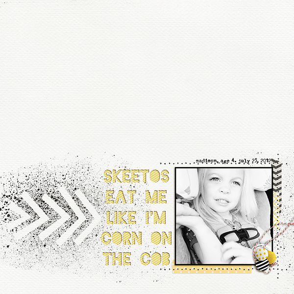
You may have noticed that layouts are getting messy...in a good way. I don't mean ugly and hard to see layouts, but ones with tons of paint splatter and airbrushing. I like this trend because it gives digital layouts an extra dimension of realism. This week I'm going to focus on airbrushing. Airbrushing can look cheesy, so be careful when using it (i.e. I don't really like butterfly cutouts). As with most things, less is more. Below are some fun examples (click on the image to see the source). Tune in tomorrow to see tutorials on how to copy this trend!
doily cutouts
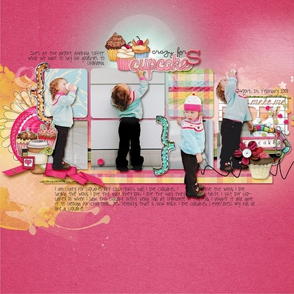
tastefully done butterfly cutout
|
star cutouts
|
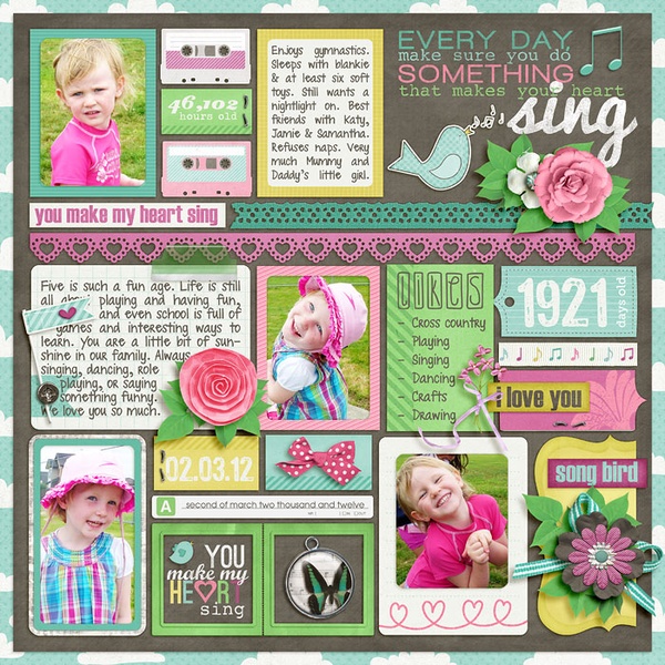
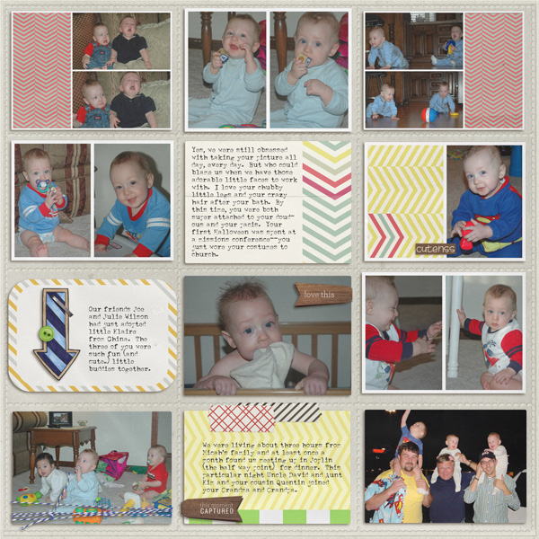
I'm baaaaack! Well, kind of. We are still getting settled, but the crazy moving/vacation month is over. It's sad, but at the same time we are ready for some normal life again. I have nothing free to give you yet, but I hope to soon. I got Illustrator online classes for my birthday so once I'm done with those I'll be a master graphic designer---haha, I wish. Today's inspiration happens to come from the same scrapbooker. I pinned each of these layouts at different times and when I put together this article, I noticed that Amber R created both. It must be her signature style. :) Notice how in both of the layouts below, she cuts out some pictures to extend beyond the box. She also splits pictures between two or more boxes. Different and fun! As always, click on the pictures to find the original source.
By Amber R
By Amber R
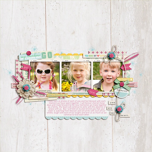
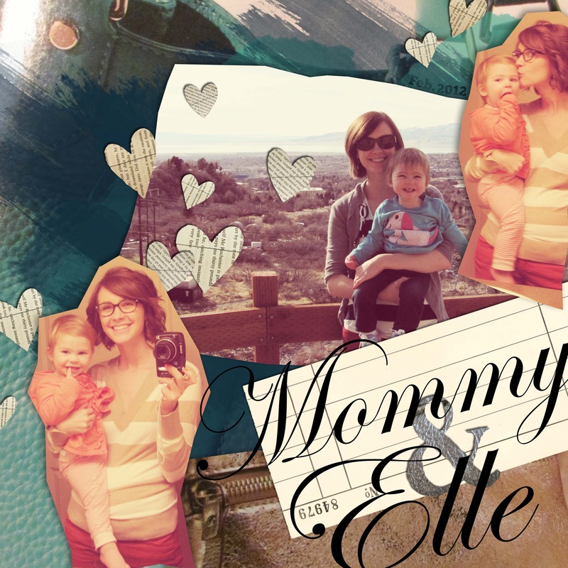
I loved the last one so much that I scrap-lifted it and created my own layout below. My daughter will one day hate me for posting pictures of her swimming without a swimsuit, but I will remind her then that she refused to wear one. For a tutorial on cutting out pictures, click here. Send me any layouts that you do with this cut out style!
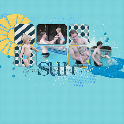
Foam Stamp Alpha-Sahlin Studio, word art and sun-Allison Pennington, background paint and splatters and sequins-Sahlin Studio's Life's a Beach, papers-Persnickity Prints
So, I was working on an Easter kit. Then it turned into two different mini-kits. Oh well, you get both for free. There aren't many elements because I lost steam and ideas and ability. The good news is that I finally got Photoshop CS and Illustrator! That means that once I learn how to use these intimidating programs, you will get even better free stuff. The bad news is that this will probably be my last post for a while. I am moving across the country and taking several long vacations over the next two months, and I won't have a computer. So, I am taking a short break, but I will be back with tons of creative ideas in July. I'm very sad to leave y'all for so long because I just started the site. Please stick with me and I promise I will be back! I will still post freebies to my pinterest board "Scrapbooking Freebies," so make sure that you follow that board for the latest freebies during my absence from the blog. (scroll down for my free Easter mini-kits)
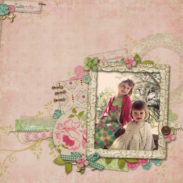
Here are some inspiring Easter/springtime layouts to help you scrap your Easter pictures. Click on the picture to link to the original page.
free easter mini-kit (number 1)
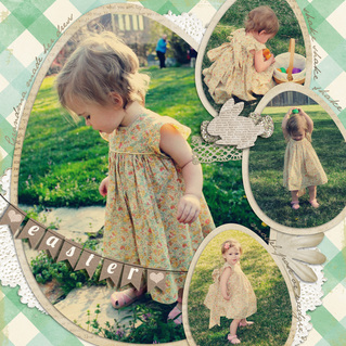
Page I did with the kit that is also available for download as a quickpage or template
free hoppy easter mini-kit (number 2)
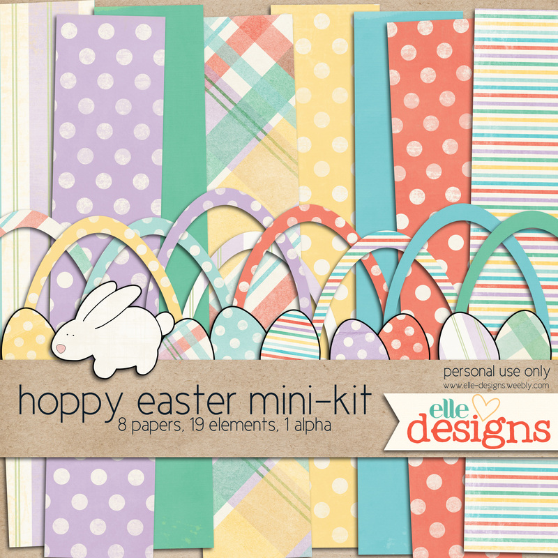
The green gingham and blue polka dot paper from the Easter kit also match this kit
|
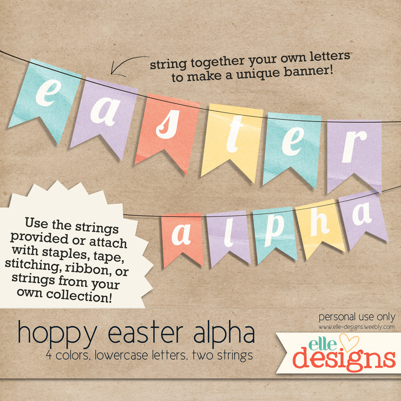
Please, please, please use stitching and string from other kits for this alpha, I don't know how to make those myself yet.
| See you in two months!
(I will have access to email so I can answer questions if you have any)
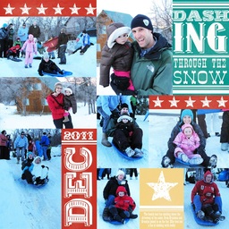
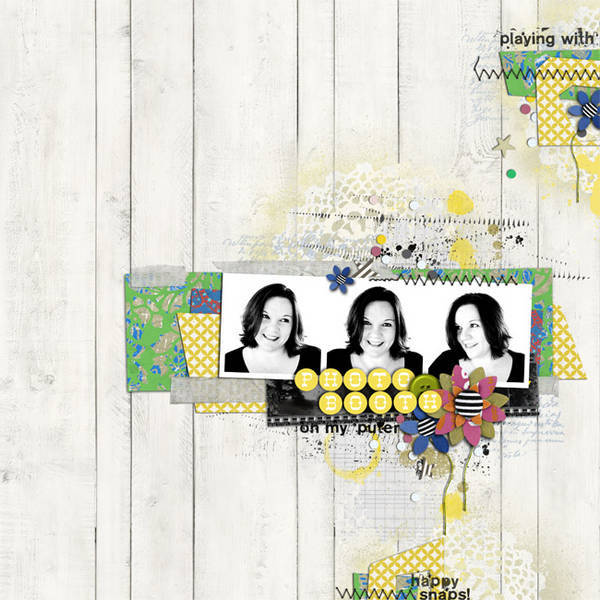
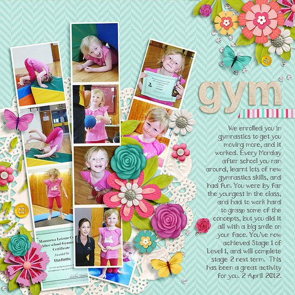
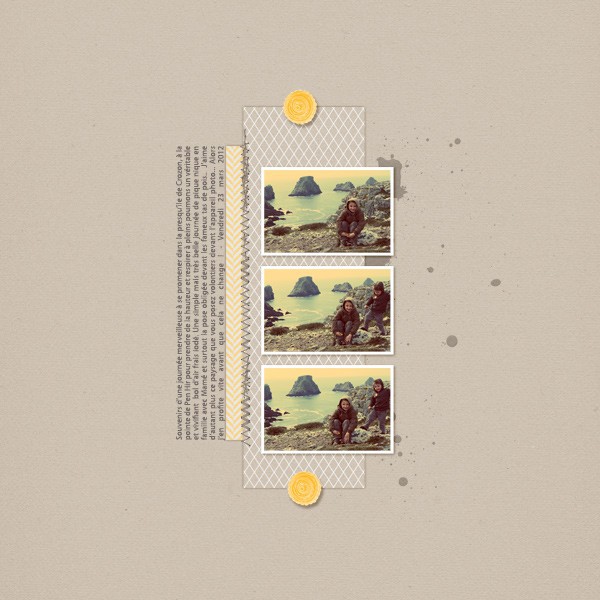
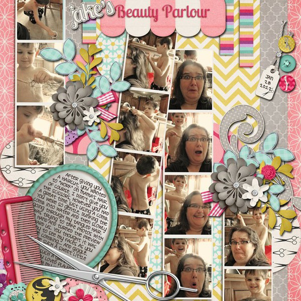
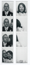
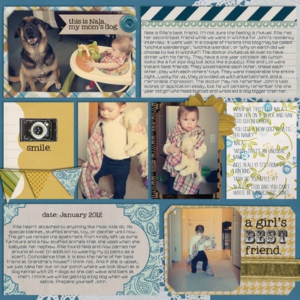
I'd like to think that I was the originator of the photobooth craze. I got the idea pre-pinterest, pre-me being on facebook, pre-blog, pre-scrapbooking six years ago as my fiance and I were standing in line for a movie. I saw a photobooth next to us in the theater and I had the brillant idea to do photobooth pictures for our engagement pictures to be sent out with the invitations. Now it isn't such a novel idea because everyone who is anyone has a photobooth at their reception, but I still like to believe I was the first. ;) Photo strips are easy ways to incorporate lots of photos onto one page. Especially if you have kids like me and you end up taking a bagillion pictures in a row to capture movement and smiles and then end up using all of them because gosh dang it, your kid is the cutest kid EVER. There are lots of things for sale to help you out, but you can always create your own using my how to create your own template tutorial. Click on the photos below to see the original link.
proof. the strip was included in the invitation sent out for our wedding. Need to do a better page with it.
strips used to show action
minimalist but cute. I saved this one a long time ago too. don't know where it is from. oscraps??
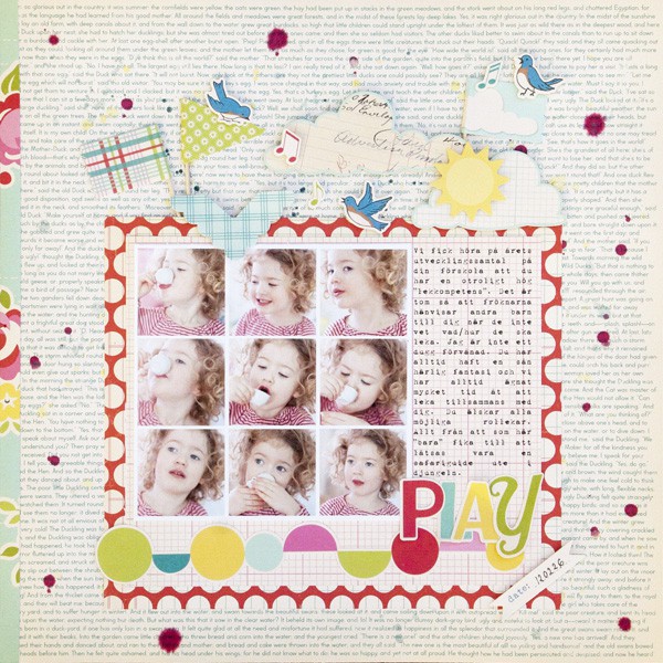
use photo strips as a block to show facial expression change
I don't like her frames, they are too simple and boring compared to the excellence that is the rest of the page. I would have done them in a different color. But I like her strip placement.
I can't find the link for this one. I saved it a long time ago. I love it for so many reasons-the title behind, the color, the banner, the cut out blocks...
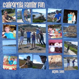
another one of mine. you can use strips as part of a collage
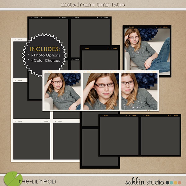
sahlin studio just put these for sale. may be worth buying when they go on sale
|
when you need to use lots of pictures without it looking too cluttered
the minimalist look-love the broken up photos that slightly change
this is mine, an example of photo strips in block form. see, I have a problem cutting photos
don't love the colors or kit from this page, but the photo strips are funny and well placed
this {yawn] boring one is mine. I like the strip, but that's pretty much it. I think I'm going to split the text and move the strip down the page.
don't like the background paper, but I like the emphasis on the strip
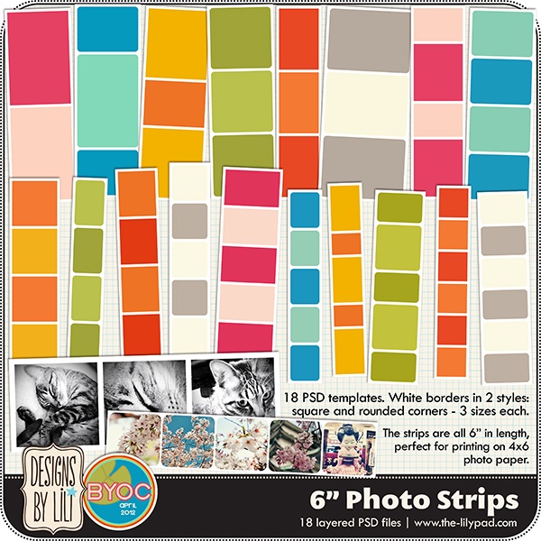
these were just put up for sale. easy to copy. hint, hint.
|
creative
other inspiring news...
Sweet Shoppe Designs is doing a wonderful thing on Pinterest! They are posting inspiring ideas for layouts and then giving you points for completing layouts from that inspiration. Read here for more details. And visit the pinterest board here. Perfect for when you have scrapbooker's block (like writer's block) even if you don't want to do it for points.
Project 365 people are crazy. One picture every day, two pages a week, for an entire year. It makes me hyperventilate just thinking about it. But as I was browsing through galleries of people's work, I realized that it could be kind of fun...kind of...if you could find the time. I figured that I write in a family journal every Sunday which I will print out eventually. Why not make it cute by including pictures and making it a Project 52? Well, Rachel, because it would be crazy...seriously CRAZY. Don't even think about it!
Anyways, what I really love about Project 365/52/24 layouts is that they include lots of writing and lots of pictures. And they still look cute. I always have the problem of having too many pictures and too much to say. These layouts give me inspiration, even if I'm just doing a Project 1 layout. Here are some I found today:
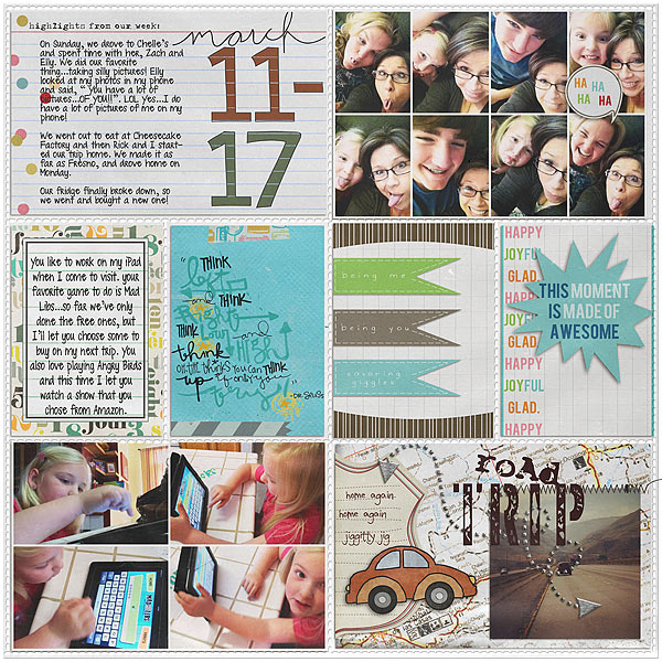
i love the candid shots grouped together at the top and the road trip combo
woah. she combined a clean style with a slightly messy style on the same page. and it works!
via
|
bright colors and clean
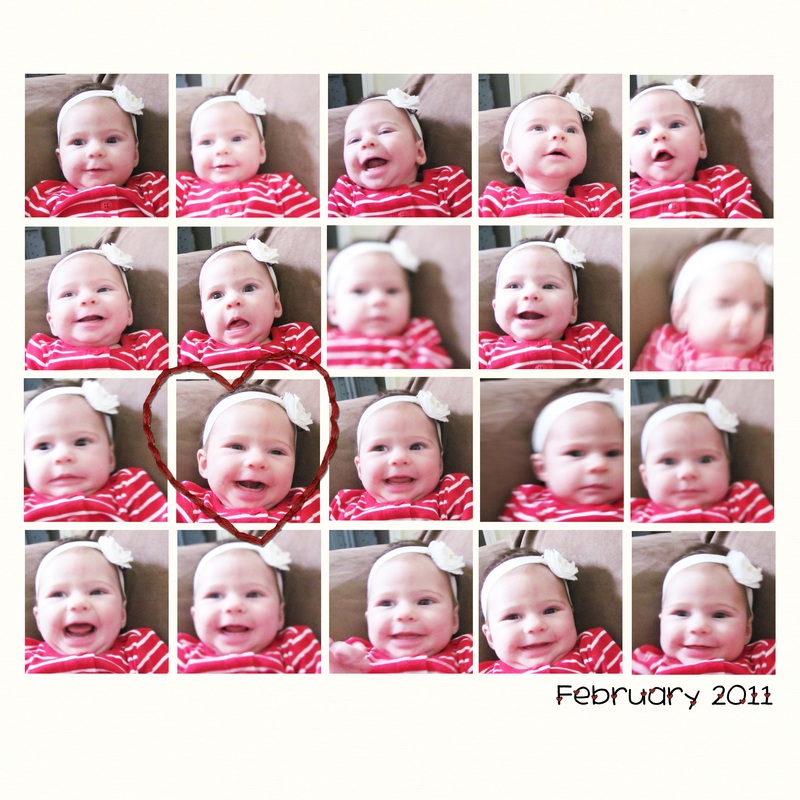
look at how many photos she fit on without it looking busy!!!! seriously, this will be my next baby book.
|
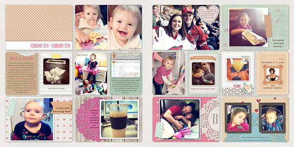
doilies, washi tape edges, clean style. love it
I hope that inspires you! And you don't have to put them in real or digital plastic dividers (although Valorie Wibbens makes really cute ones). Here's a layout I did copying a Project 365 type.
kit: jenn barrette's blue skies font: my own topher and the deck
Don't forget to get the freebies on Oscrap's birthday blog hop! Start at oscraps.com. Also, shabbyprincess.com/blog just came out with another cute 2 page monthly layout.
My friend asked me a question over the weekend that applies to most--wait, scratch that--ALL scrappers. Do I start scrapbooking pictures from the beginning or just start now and go forward?
This is a hard question. When I started digital scrapbooking, I had 6 years of pictures to scrap (like dating my husband, trip to Europe, getting married) plus the pictures of events that were currently happening. I decided to start with the current pictures and move forward, my reasoning as follows:
1. Recent pictures were the most exciting because they had just happened
2. After a week, I have a hard time remembering people's names and details of events so trying to journal about events from 6 years ago would have been hopeless
...and...
3. Just thinking about scrapping the endless files of pictures from events and people I don't remember made me want to set fire to the computer and say, oops, all of the pictures are gone now...
So I just pretended that those pictures never existed. Actually, as I got faster at scrapbooking it was easier to catch up on current events so I had time to go back and scrap pictures from years ago. I am officially caught up now, but I cheated. Here's how you can too. (These rules are also the same for when you want to scrap something fast like you have a printing coupon that expires in two weeks)
rules for catch-up scrapping
scrap only the most important pictures
(or the ones where you look really cute)
I have lots of pictures from when we were dating. Not all of them are good. So I only choose the best ones or the ones that were most meaningful to me. When I say I am caught up, that doesn't mean I scrapped all of my pictures, some I just don't care for and that's okay.
cram the pictures in!
This layout makes me laugh, but I really just wanted to get this event scrapped. When catching up, put as many photos on as you can (you don't have to be as dramatic as this example, but please put more than 2 pictures on a page).
forget the journaling
Don't hurt your brain by trying to remember details. People really only want to look at pictures anyways.
ditch the elements and fancy stuff
Just choose a cute paper as the background, add the pictures, add a title and a date, then call it done. It won't be the cutest layout ever, but it will be done. Save the cute stuff for current pictures.
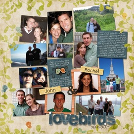
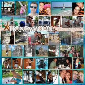
save (or pin) layouts with lots of photos I have a file for example layouts that I see online that use lots of photos. Then when I have time to do some catching up, I have lots of examples to choose from and copy. I don't have to waste time trying to figure out what I want it to look like. All of the examples from above (except the maniac honeymoon layout) were copies of layout ideas from someone else.
One of the best ways to catch up fast is to use templates. Come back tomorrow for a tutorial on how to create your own templates (and use them)!
The only way I will keep myself blogging regularly (for the two people who read this) is to have a theme for certain days. I'm thinking Monday Muse for inspiration on layouts, Trendy Tuesday for information on scrapbooking/design trends, Tutorial Thursday for tutorials, and Friday Freebie for free things (mine or others'). I won't do each every week, but it will help me organize what I want to share with y'all.
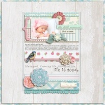
This week's Monday Muse is more design-y than cutesy, but I like both styles. Sometimes I get sick of the cutsey scrapbooking and want to try something new. I was inspired by these two images that I found last week.
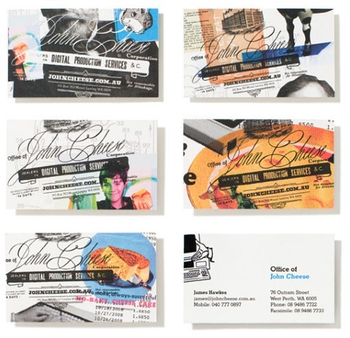 Business cards as seen on oh, hello friend. | 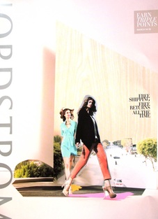 Nordstrom catalog |
I miss doing collages. In the past, when I cut out people from images on photoshop, I usually spent a painstakingly L-O-N-G time cutting them out exactly. That's why I loved the chunky, imperfect cutout of the girls on the cover of the Nordstrom catalog (click on the image to make it bigger so you can see this). It is really easy to do with the polygonal lasso tool. The really nice part about doing a collage digitally is that if I cut out something wrong, I could undo and try again. Here is what I came up with combining the two styles. Something is still off about it, but I can't pinpoint what (I'm thinking the middle photo). It's like abstract art; everyone looks at abstract art and thinks their 5-year-old could do it, but when you actually sit down to do something abstract, it is incredibly hard. Everything has to have meaning and purpose. Even a font, paint spatter, and a placement of a photo. Don't let this scare you from trying it out! It was very fun to create. Email me your layout if you decide to try to copy this inspiration. Find the credits for the individual pieces and fonts below the picture.
 Credits: Purse photos came from Nordstrom catalog from March '12; Fonts: Edwardian Script, Geneva, Chunk Five; All else was mine
|